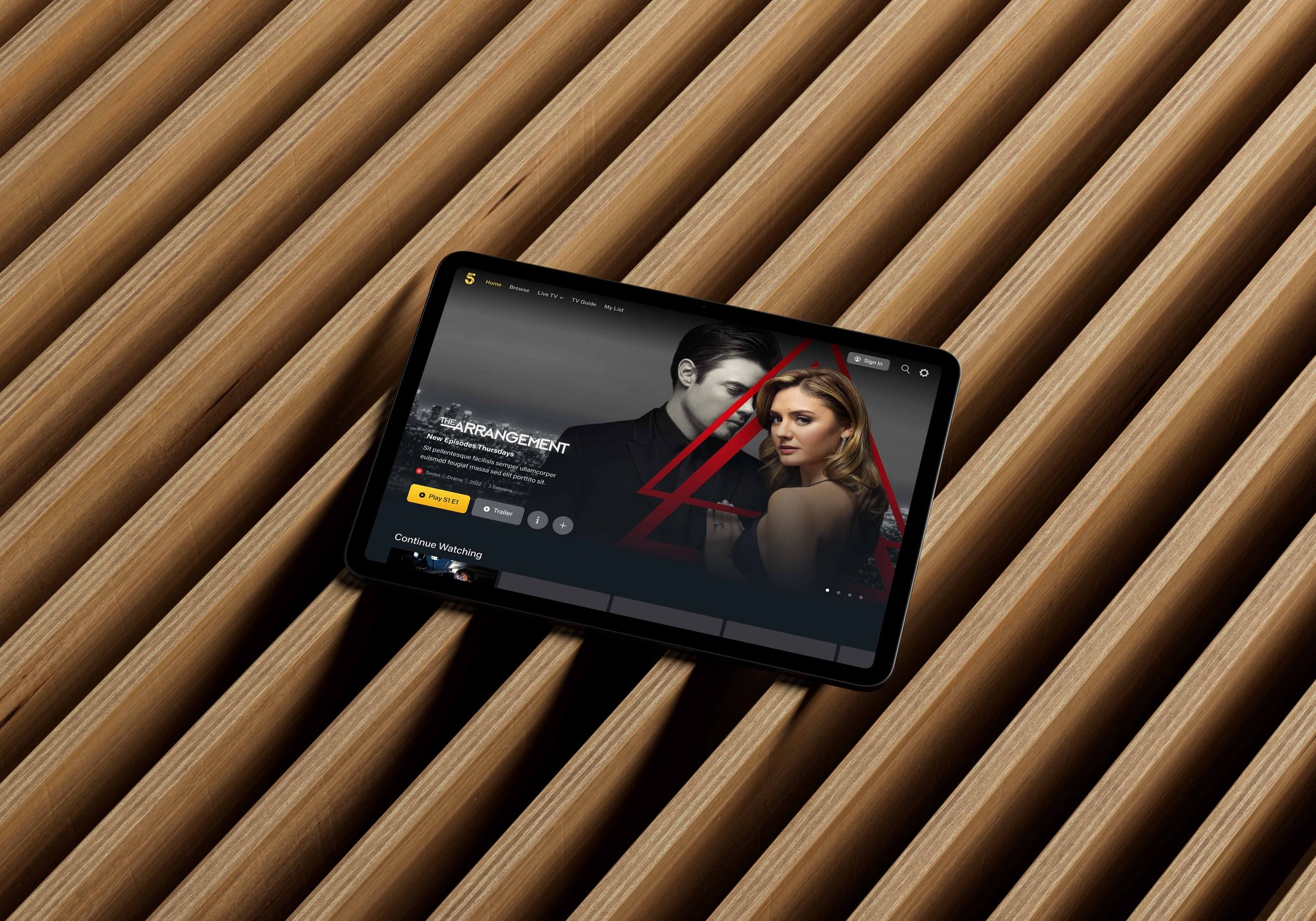
Aligning design systems and improving content discovery on Channel 5
In 2014, Viacom's acquisition of Channel 5, a major player in the UK's media landscape, accelerated their strategy in this key market. However, the subsequent outsourcing of design work for My5, Channel 5's on-demand platform, led to inconsistencies across the platform compared to Viacom's established channels like MTV and Nickelodeon.
As the sole UK-based designer, I tackled the challenge of unifying My5's visual language and establishing a consistent design system across the Paramount Networks portfolio. My core belief was that this consistency would not only streamline development but also enhance user experience and potentially expand My5's user base due to increased brand recognition across Paramount Network channels.
The project wasn't without its hurdles. One key challenge was balancing feature improvements with design system alignment. My5 boasted a vast content library compared to other channels, requiring unique categorisation beyond simple "Movies" and "Series." We tackled this through user testing and brainstorming to develop solutions tailored to My5's specific needs.
To comply with my non-disclosure agreement, I have omitted and obfuscated confidential information in this case study. All information in this case study is my own and does not necessarily reflect the views & facts of the company.
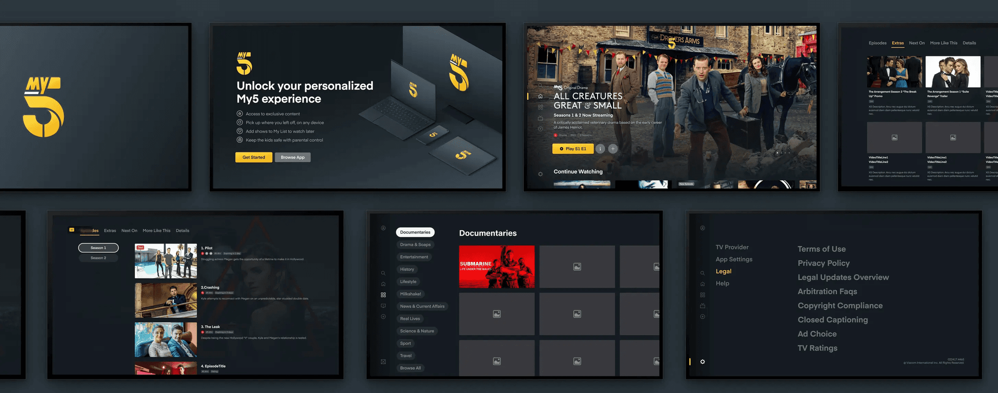
Overview
My time at Paramount was spent focussing on aiding the UK based Channel 5 (My5)
Client
Paramount (Formerly Viacom)
Timescale
2022 - 2023
Role
Product Designer, Workshop facilitation, Stakeholder management, Rapid prototyping, User research, Visual design,
The challenge
Balancing alignment and the need for innovation of outdated user experiences
Following the acquisition of My5, design responsibilities were outsourced to an external agency. This led to inconsistencies between My5's design and the broader multi-brand design system used by other brands like BET, MTV, and Nickelodeon.
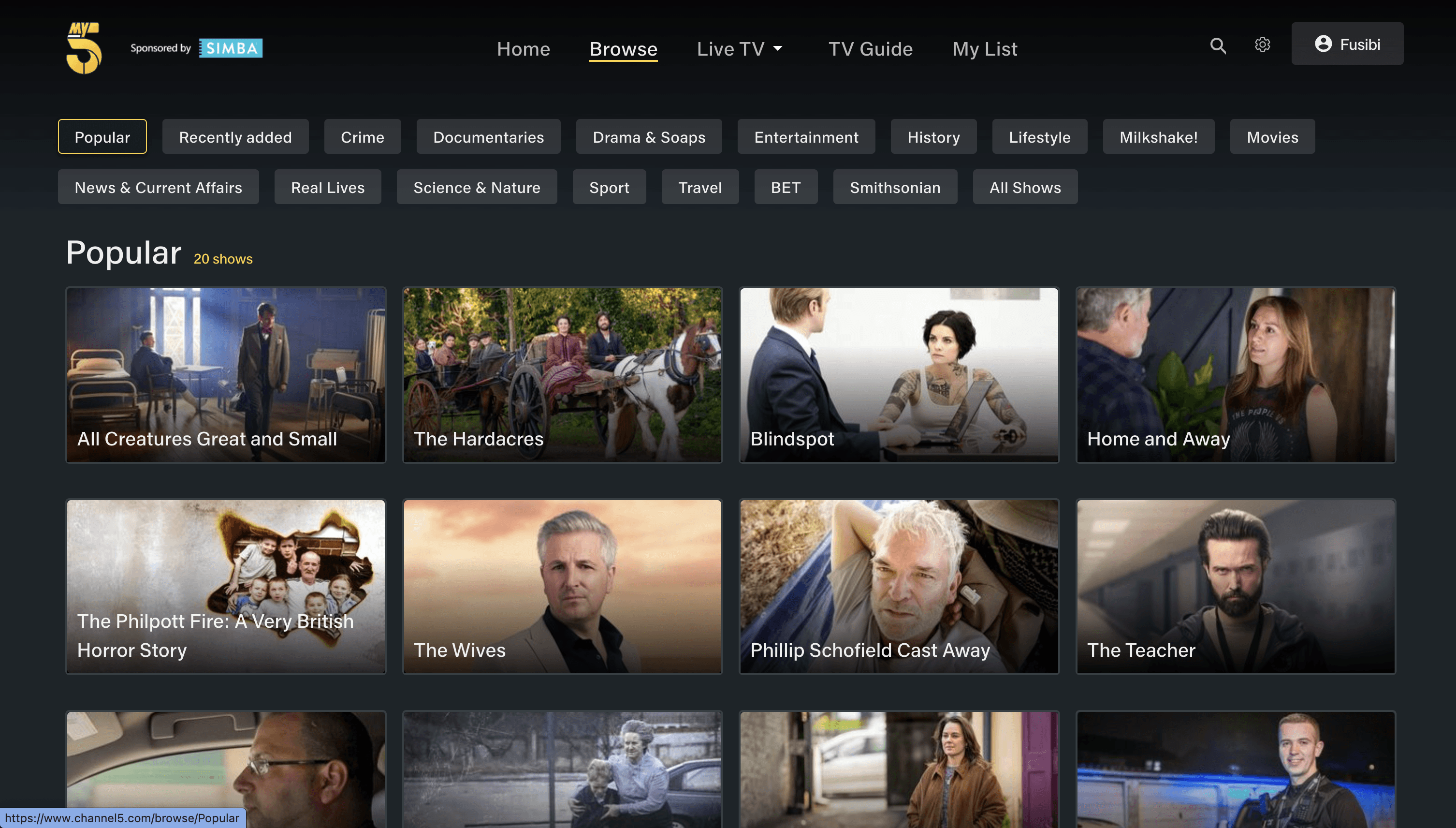
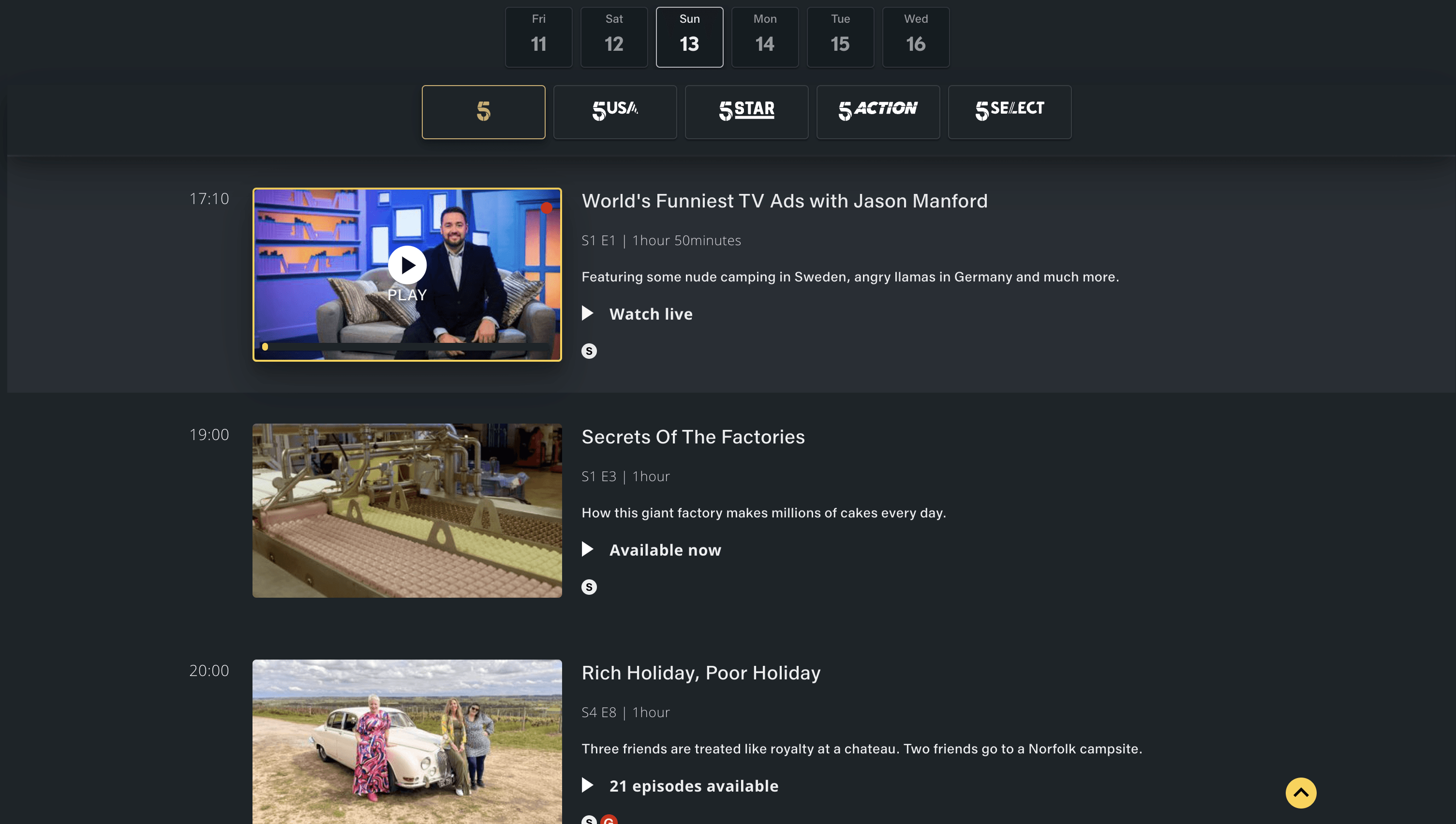
To address this, we collaborated with project managers and the lead designer in the US to identify areas for alignment. The live TV player and browsing experience were prioritized based on their impact on user experience and the complexity of implementation. Through careful analysis, we determined the most effective approach to streamline these elements across the design system.
Some early issues identified when looking at the designs done externally:
Lack of accessibility consideration and guidelines
Components not built using up to date Figma features
Inconsistent and fragmented experiences across brand and product
Not all components being used in designs have been built
Doesn’t cover all platforms and touch points (only consumer app)
Updated designs focussed on web
No governance guidelines or roadmap for adding new features/components
With a number a platforms to be tackled the scope of the work grew. This alignment would need to be designed and developed for tvOS, Android tv, WebOS, Android, Web and iOS.
The solution
Research presented us with valuable insight that helped us in creating an amazing solution.
The first action of this project involved understanding the opportunity from a business point of view and identifying the correct problem to solve for our users. This process involved thinking about dealers' and sellers' needs and objectives. Based on our research findings, we identified a core set of features and functionalities necessary to include in our minimum viable product (MVP). These key features would be beneficial in helping us be distinguishable enough from our competition and also ensure we were tackling the needs of our future users.
Access to seller information
One distinguishing factor from our competitors in the space was that we already had a foundation of information about these vehicles that would be filtered through the app. This was a huge benefit because it meant drivers could not only have a great deal of context but also could verify information that was reportedSmoother questioning
A lot of what was done during the research phase was looking at how we could also stop duplicate questions + also unnecessary questions that had become standard but didn't add much value to the experience. adjusting all of this meant we could offer a more efficient set of questions that still presented as valuable of an output as our competition


Testing the alpha
We moved into development after testing a high-fidelity prototype internally and on calls with stakeholders. The app was first built for iOS, utilising the existing Motorway design system and iOS native components. We spent six months building what we called the "Alpha." This product version allowed us to take it into the field and test it with real drivers. The importance of this was twofold: we could gather feedback from drivers and observe how they interacted with the app. This part of the project proved to be incredibly insightful, teaching us a lot more about our product.
Key objectives
Understand how drivers will use the new app
Identify usability issues or errors
Identify opportunities for improvement
High-Level Hypotheses
Drivers can conduct an inspection from start to finish without major issuesDrivers find the app easy to use and are able to navigate through it seamlesslyDrivers understand and value the approach of confirming seller-declared informationDrivers find the driver app checks comprehensive enough.
How did we do ?
All 4 hypothesis were either partial or true, which was very positive for the team and meant our direction wasn’t going to shift too much in order to release a ‘Beta’. Based on this testing we generated 24 recommendations for our next steps, ranging from high priority to low.
Nothing is quite "final", is it?
Late January, we went live with the mobile app for iOS users and staggered the launch for our key transport providers, we came across a few initial challenges but these were easily overcome. Since then we have continued to make improvements to the application launching with key features.
One of those more recent key features was a demo jobs which was based on the need for drivers, internal staff and more to get a hands on experience of using the app without needing to have a job assigned to them.
Key features


Through continuous testing and adaptation of our designs since the release of the product we have been able to determine that the product is beneficial to users and has indeed made the process much more efficient.
50%
increase in inspection efficiency
90%
adoption rate due to streamlined workflow
19,000+
Since the January launch app
The journey for this app doesn't end here and the team continues to iterate and tackle user challenges that arise. Post-launch the team tackles tech debt and further efficiencies where necessary. A thorougly enjoyed exprience that allowed me to tackle an area not ventured into by the business
